Theming
Theming can be done by editing the CSS variables in the base stylesheet, or if you install a theme plugin
CSS Variables
@webtui/css ships with a set of CSS variables that control font styles and background/foreground colors
These can be customized with the CSS :root selector on the base layer
@layer base {
    :root {
        --font-size: 18px;
        --font-family: 'JetBrainsMono', monospace;
    }
}
Font Styles
@layer base {
    :root {
        --font-size: 16px;
        --line-height: 1.3;
        /* Font weight for bold text */
        --font-weight-bold: 700;
        /* Font weight for regular text */
        --font-weight-normal: 400;
        --font-family: monospace;
    }
}
Colors
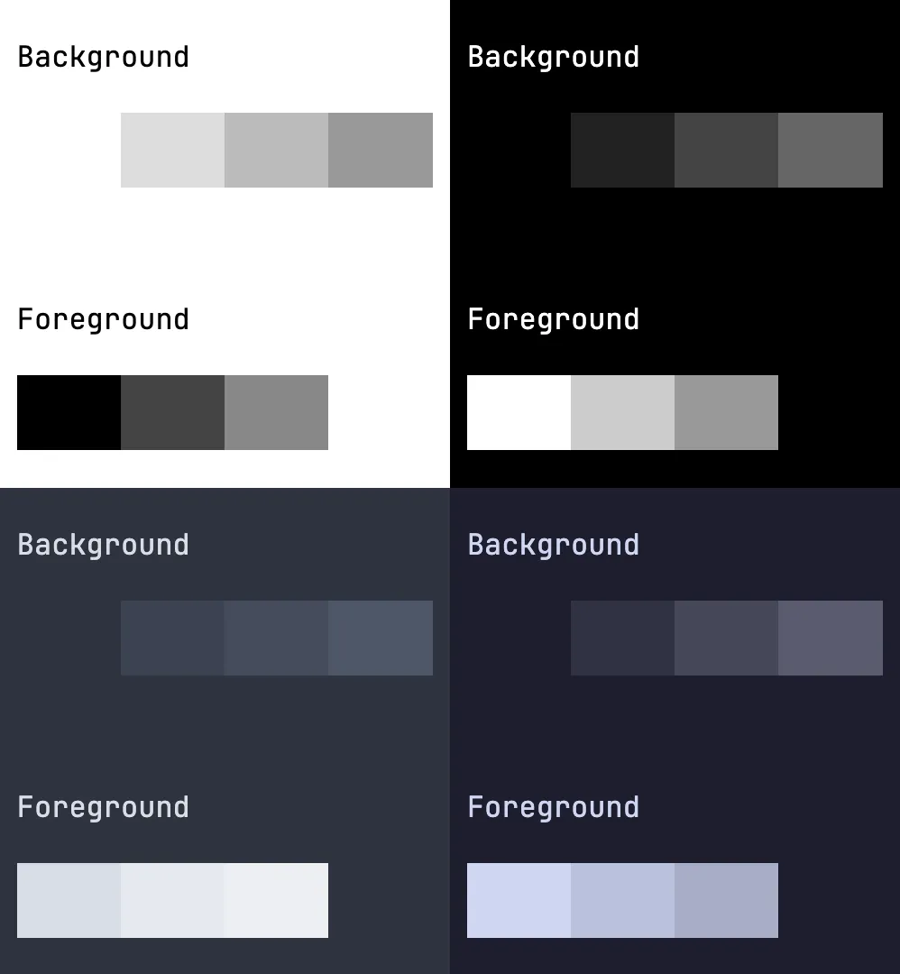
The base theme consists of four background levels and three foreground levels
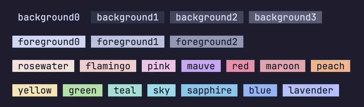
Additional color accents/variants can be added to components individually with CSS or by importing a theme plugin
@layer base {
    :root {
        /* Default background color */
        --background0: #fff;
        /* Background levels 1-3 */
        --background1: #ddd;
        --background2: #bbb;
        --background3: #999;

        /* Default foreground color */
        --foreground0: #000;
        /* Foreground levels 1-2 */
        --foreground1: #444;
        --foreground2: #888;

        /* Border colors for various components/utils */
        --box-border-color: var(--foreground0);
        --table-border-color: var(--foreground0);
        --separator-color: var(--foreground0);
    }
}
Shown below is a screenshot showing the background and foreground colors of a basic light theme, dark theme, Nord, and Catppuccin
Light & Dark
@webtui/css ships with a basic light and dark theme
To enable the dark theme, simply add data-webtui-theme="dark" to the <html> tag, or any element that should inherit the theme colors
<html data-webtui-theme="dark"></html>Theme Plugins
Theme plugins change the base colors and often include additional color variants and styles for individual components
Check out the Plugins page for a list of available themes
Using Multiple Theme Accents
Some themes provide different accent colors such as --red, --green, etc
Not all themes use the same accent names (e.g. --blue vs --aqua)
If you intend to use multiple themes, you can use CSS variable fallbacks to use the desired accent color
#my-element {
    color: var(--gb-aqua, var(--blue, var(--cyan)));
}