Button
Displays a button
| 1 | |
| 2 | <button>Click Me</button> |
| 3 |
Theme
Import
@import '@webtui/css/components/button.css';To add box borders to button, import the Box Utility stylesheet (optional)
@import '@webtui/css/utils/box.css';Usage
<button>button</button>Apply is-="button" to any HTML element to style it as a button
<div is-="button">div with button style</div>Examples
Variants
| 1 | |
| 2 | <button variant-="background0">background0</button> |
| 3 | <button variant-="background1">background1</button> |
| 4 | <button variant-="background2">background2</button> |
| 5 | <button variant-="background3">background3</button> |
| 6 | <button variant-="foreground0">foreground0</button> |
| 7 | <button variant-="foreground1">foreground1</button> |
| 8 | <button variant-="foreground2">foreground2</button> |
| 9 |
Theme
Available variants match the base theme colors
Box Borders
Requires the Box Utility
| 1 | |
| 2 | <button box-="round">Round</button> |
| 3 | <button box-="square">Square</button> |
| 4 | <button box-="double">Double</button> |
| 5 |
Theme
Sizes
| 1 | |
| 2 | <button>Default</button> |
| 3 | <button size-="small">Small</button> |
| 4 | <button size-="large">Large</button> |
| 5 |
Theme
disabled
| 1 | |
| 2 | <button disabled>Disabled</button> |
| 3 |
Theme
Reference
Properties
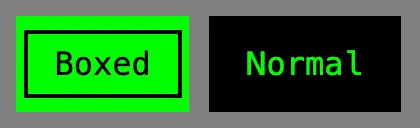
--button-primary: The primary color of the button--button-secondary: The secondary color of the button
button {
    --button-primary: black;
    --button-secondary: green;
}
Buttons automatically switch between --button-primary and --button-secondary based on whether box- is applied or not
Extending
To extend the Button stylesheet, define a CSS rule on the components layer
@layer components {
    button,
    [is-~='button'] {
        &[variant-='red'] {
            --button-primary: red;
            --button-secondary: white;
        }

        /* ... */
    }
}
Scope
button,
[is-~='button'] {
    /* ... */
}