Popover
Creates a popover component powered by the Details and Summary elements
| 1 | |
| 2 | <details is-="popover"> |
| 3 | <summary>Click Me</summary> |
| 4 | <div>Popover content</div> |
| 5 | </details> |
| 6 |
| 1 | |
| 2 | div { |
| 3 | background-color: var(--background1); |
| 4 | padding: 1lh 1ch; |
| 5 | } |
| 6 |
Theme
Import
@import '@webtui/css/components/popover.css';Usage
<details is-="popover">
    <summary>Popover</summary>
    <div>Popover content</div>
</details>
Examples
Positioning
Use the position- property to control the position of the popover
Pass two values into position- to set the horizontal and vertical position anchor
<details is-="popover" position-="<anchor>"></details>
<details is-="popover" position-="<x-anchor> <y-anchor>"></details>

<details is-="popover" position-="center"></details>
<details is-="popover" position-="start end"></details>| 1 | |
| 2 | <div class="row"> |
| 3 | <details is-="popover" position-="bottom right"> |
| 4 | <summary>BR ↘</summary> |
| 5 | <div class="popover-content">Popover content</div> |
| 6 | </details> |
| 7 | <details is-="popover" position-="bottom left"> |
| 8 | <summary>BL ↙</summary> |
| 9 | <div class="popover-content">Popover content</div> |
| 10 | </details> |
| 11 | </div> |
| 12 | <div class="row"> |
| 13 | <details is-="popover" position-="top right"> |
| 14 | <summary>TR ↗</summary> |
| 15 | <div class="popover-content">Popover content</div> |
| 16 | </details> |
| 17 | <details is-="popover" position-="top left"> |
| 18 | <summary>TL ↖</summary> |
| 19 | <div class="popover-content">Popover content</div> |
| 20 | </details> |
| 21 | </div> |
| 22 |
| 1 | |
| 2 | body { |
| 3 | display: flex; |
| 4 | flex-direction: column; |
| 5 | gap: 1lh; |
| 6 | justify-content: center; |
| 7 | height: 100vh; |
| 8 | } |
| 9 | .row { |
| 10 | display: flex; |
| 11 | gap: 1ch; |
| 12 | aling-items: center; |
| 13 | justify-content: center; |
| 14 | } |
| 15 | summary { |
| 16 | background-color: var(--background1); |
| 17 | } |
| 18 | .popover-content { |
| 19 | background-color: var(--background1); |
| 20 | white-space: nowrap; |
| 21 | padding: 1lh 1ch; |
| 22 | } |
| 23 |
Theme
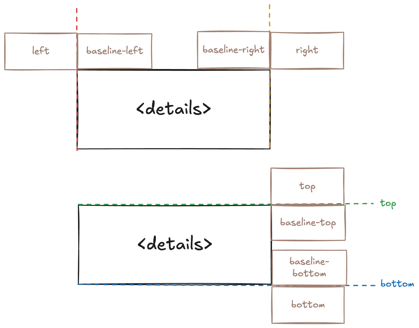
Use baseline-* values to position the content relative to the edges of the popover
| 1 | |
| 2 | <div class="row"> |
| 3 | <details is-="popover" position-="bottom baseline-right"> |
| 4 | <summary>Bottom Baseline-Right</summary> |
| 5 | <div class="popover-content">Popover content</div> |
| 6 | </details> |
| 7 | <details is-="popover" position-="bottom baseline-left"> |
| 8 | <summary>Bottom Baseline-Left</summary> |
| 9 | <div class="popover-content">Popover content</div> |
| 10 | </details> |
| 11 | </div> |
| 12 | <div class="row"> |
| 13 | <details is-="popover" position-="right baseline-top"> |
| 14 | <summary>Right Baseline-Top</summary> |
| 15 | <div class="popover-content">Popover content</div> |
| 16 | </details> |
| 17 | <details is-="popover" position-="left baseline-bottom"> |
| 18 | <summary>Left Baseline-Bottom</summary> |
| 19 | <div class="popover-content">Popover content</div> |
| 20 | </details> |
| 21 | </div> |
| 22 |
| 1 | |
| 2 | body { |
| 3 | display: flex; |
| 4 | flex-direction: column; |
| 5 | gap: 1lh; |
| 6 | } |
| 7 | .row { |
| 8 | display: flex; |
| 9 | gap: 1ch; |
| 10 | } |
| 11 | summary { |
| 12 | background-color: var(--background1); |
| 13 | } |
| 14 | .popover-content { |
| 15 | background-color: var(--background1); |
| 16 | white-space: nowrap; |
| 17 | padding: 1lh 1ch; |
| 18 | } |
| 19 |
Theme
The image below shows the values and positions that can be used in the position- property
Backdrop
| 1 | <details is-="popover"> |
| 2 | <summary>Click Me</summary> |
| 3 | <div class="popover-content">Popover content</div> |
| 4 | </details> |
| 5 | <p>This appears behind the backdrop</p> |
| 1 | |
| 2 | body { |
| 3 | display: flex; |
| 4 | flex-direction: column; |
| 5 | gap: 1lh; |
| 6 | } |
| 7 | [is-='popover'] { |
| 8 | --popover-backdrop-color: rgba(0, 0, 0, 0.5); |
| 9 | } |
| 10 | .popover-content { |
| 11 | background-color: var(--background1); |
| 12 | white-space: nowrap; |
| 13 | padding: 1lh 1ch; |
| 14 | } |
| 15 |
Theme
Caveats
Elements using the box- utility that appear after the popover in the html markup will appear above the popover content no matter what z-index you provide
<style>
    .column {
        display: flex;
        flex-direction: column;
    }
</style>

<div class="column">
    <details is-="popover">
        <summary>Popover</summary>
        <div>Popover content</div>
    </details>
    <div box-="square">
        Will appear above the open popover since defined after it in the html
    </div>
</div>
As a workaround, you can set the flex-direction to row-reverse or column-reverse on the parent element of the popover
<style>
    .column-reverse {
        display: flex;
        flex-direction: column-reverse;
    }
</style>

<div class="column-reverse">
    <div box-="square">
        Will appear behind the open popover since defined before it in the html
    </div>
    <details is-="popover">
        <summary>Popover</summary>
        <div>Popover content</div>
    </details>
</div>
Reference
Properties
--popover-backdrop-color: The background color of the backdrop (transparent by default)--popover-offset-x: The horizontal offset of the popover--popover-offset-y: The vertical offset of the popover
#my-custom-popover {
    --popover-backdrop-color: rgba(0, 0, 0, 0.5);
    --popover-offset-x: 1ch;
    --popover-offset-y: 1lh;
}
Extending
To extend the Popover stylesheet, define a CSS rule on the components layer
@layer components {
    details[is-~='popover'] {
        &[variant-='inverted'] {
            /* ... */
        }

        /* ... */
    }
}
Scope
details[is-~='popover'] {
    /* ... */
}